My Role
For this project, my role was to focus on User Experience and information gathering. I did not work on the mobile development, but focused mainly on user research and visual design
For this project, my role was to focus on User Experience and information gathering. I did not work on the mobile development, but focused mainly on user research and visual design
Currently, when students need to find out their desitnation, they can use the Texas A&M Bus Route website. This website is the only way for students to look at potential bus route locations and which bus to take.
However, this website is outdated and unintuitive to use. The user feedback from clicks is uninspiring and there is no sense of user personalization. On the map, each route is a different color and there is no indication of where the user is or where any of the stops are. I hope to add features that allow the user to list where they are as well as their destination point.

Most user research done was from word of mouth and from personal experience. Since I was already a student on campus, contextual observation (going there and actually doing it yourself) was a potential method of observation to use. In addition to using the bus service, I also asked close friends as well as classmates on their opinion on the current bus route using a survey.
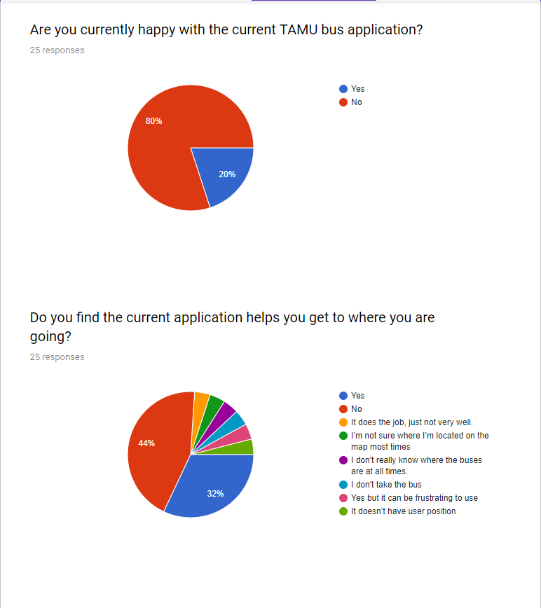
The first step in this process was to survey students on their opinions of the bus transportation system using an online survey format. This was to gauge if there is interest in changing up the current format.

Looking at these responses, I noticed that most users were negative, yet there were some responses which indicated that the current framework worked, but was frustrating to use. Therefore, I decided that it would be best to incorporate new elements as well as keep the favorable elements from the old UI.
Now that I know "who" the application applies to, I can begin to focus on making the "when" and "why" aspect of the app. I ask myself, when would someone use my application: frequently or rarely? In what situation would someone want to use this application? Why would someone choose to use a new application instead of the old one? These questions can be answered using storyboards or creating user scenarios.
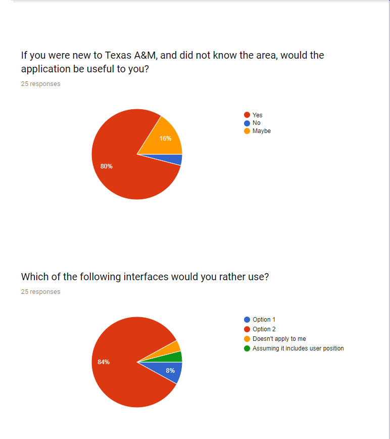
One user scenario that I came up with is someone who is on campus for their first time at a new student conference. I imagine what they possibly would want to see in an wayfinding application that the current one lacks. They would first need an efficient search query, not a list of buildings to choose from. Second, they would also need to know where they were on campus. These two specifications are crucial and functions that I want to implement in my solution.

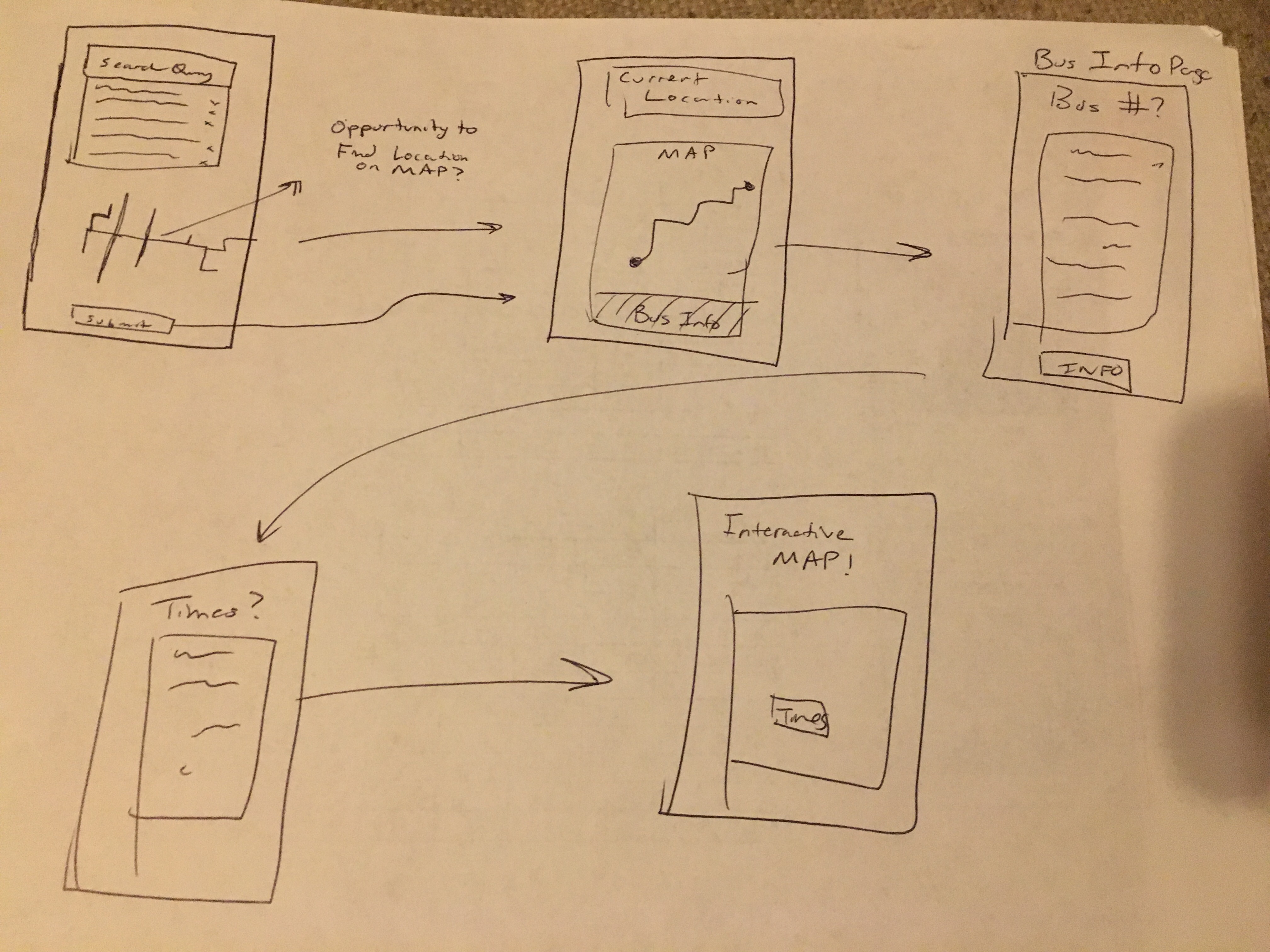
The next thought process after creating user storyboards would be to create a quick sketch of what I wanted my base prototype to look like. I sketched out a quick picture of a base search query to get me started. Though basic, I never underestimate good sketches, as it usually helps me go right into building prototypes.
After creating a high fidelity prototype, I went back to my users who ran my survey previously and asked them to use the new prototype. It is important to note that I wanted to use the same individuals as before as to get a good look at the before and after feedback stages of my application.
